Archive for the 'process' Category

Apr 08 2019

All About Endpapers, or What You’ve Been Missing If You’ve Only Seen the Paperback of The Odyssey and The Iliad

A lot of my readers are not aware that the hardcover editions of The Odyssey and The Iliad have art in them that does not appear in the paperback editions.

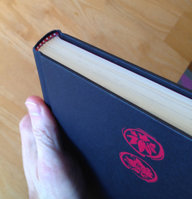
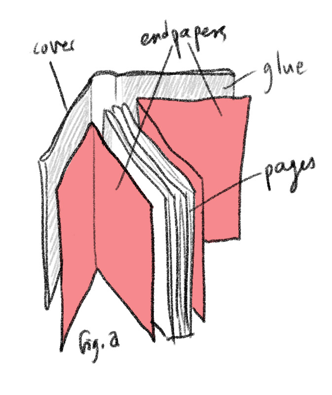
At the beginning and end of a hardcover book is something called the Endpapers (or simply “ends”). These are usually separate sheets of paper that are used to bind the inside pages to the cover.

Ends fig a

Here are the endpapers I created for The Odyssey (click to see larger!)

Ends fig b

These are all actual vase paintings from classical Greece. Some of them are explicitly scenes from The Odyssey, others I just found thematically appropriate to allude to the story of Odysseus. In some cases I changed what kind of vessel they are painted on — in real life some are tiny and some are huge, and I wanted them to be more uniform in size.

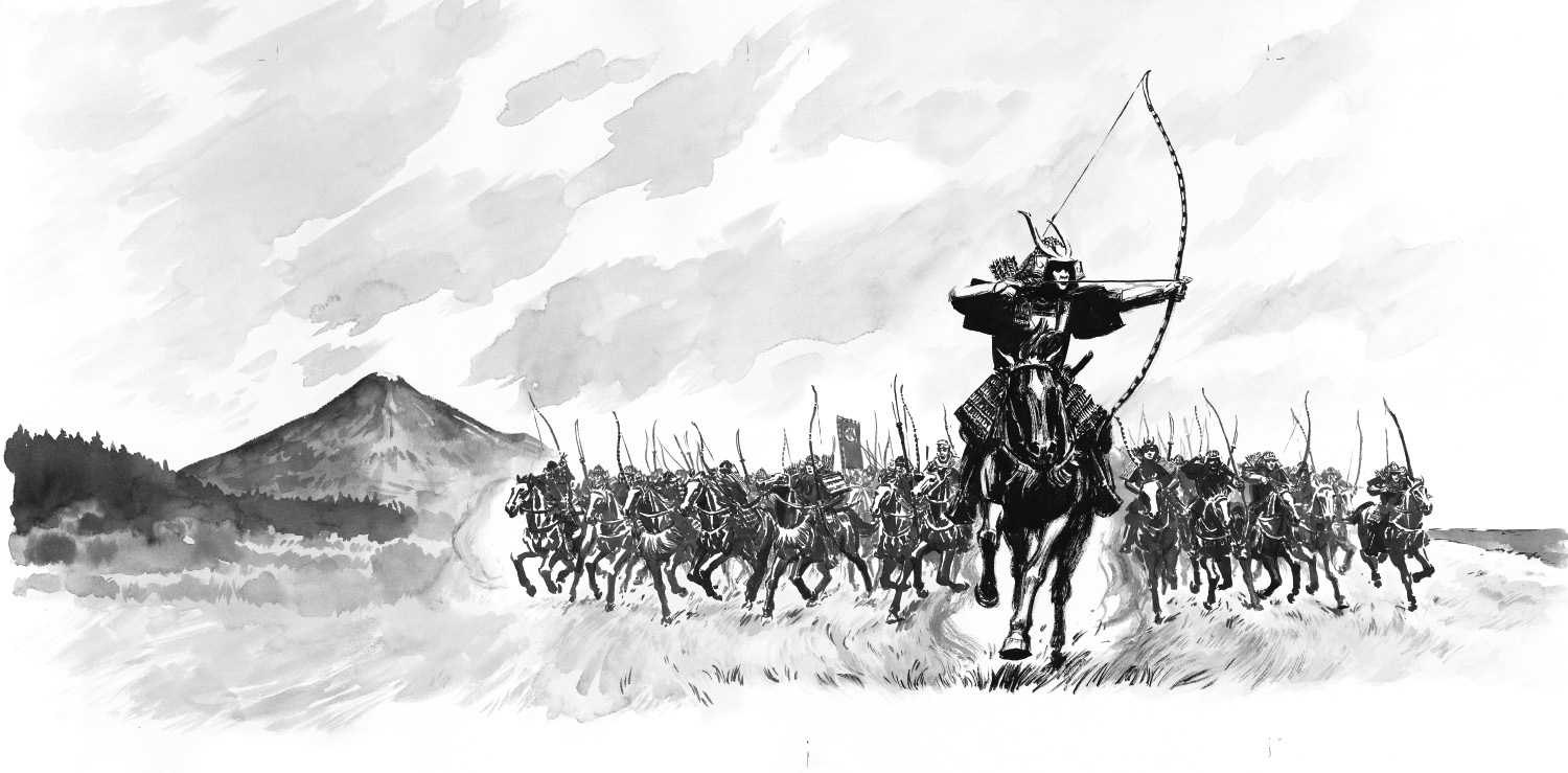
For The Iliad, I chose a different approach. Here I use shields to tell the story of the lead-up to The Iliad. Again, you will only get these if you get the hardcover; but now at least you can see what you’re missing. In the book they’re printed in blue.

Ends fig c Ends fig d

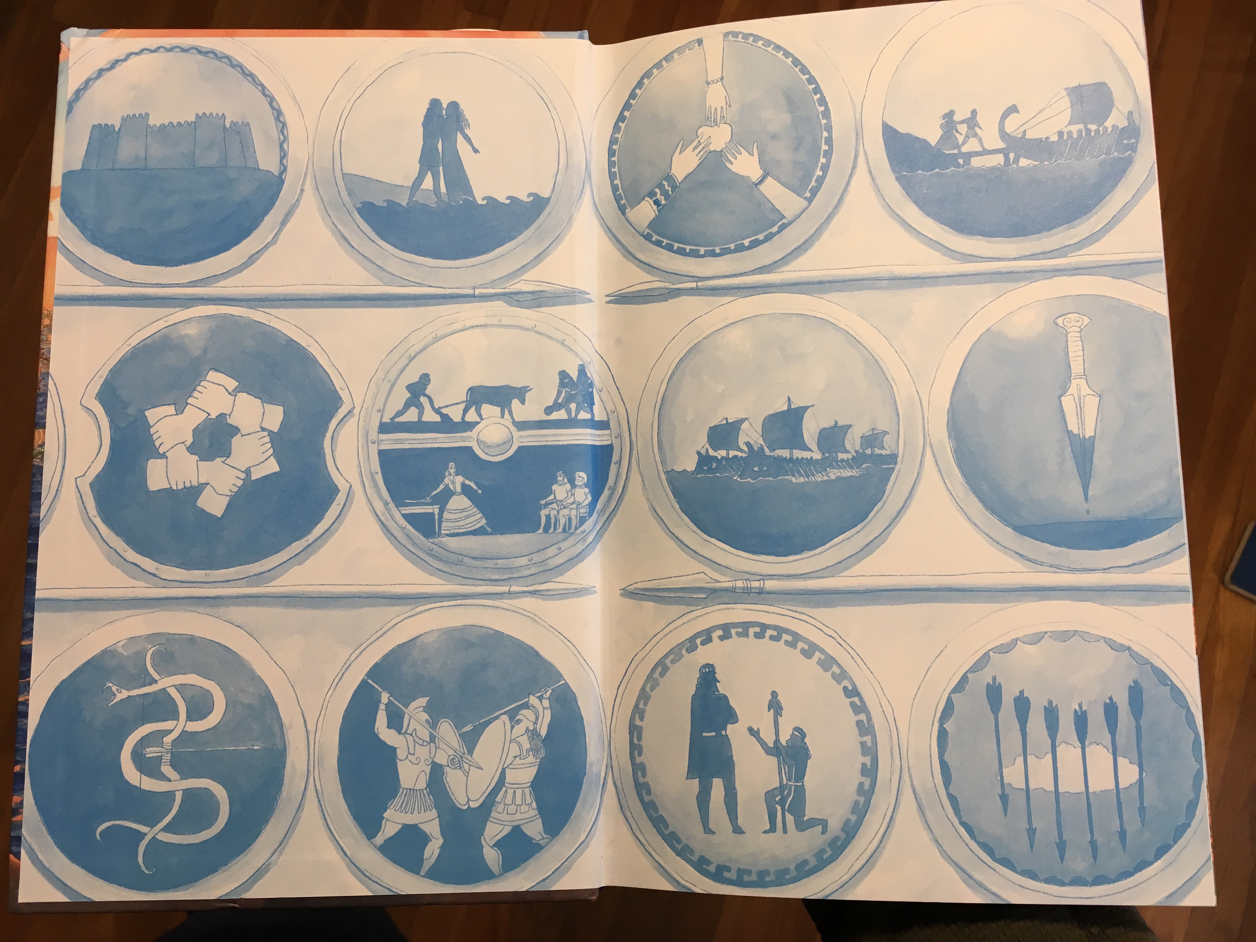
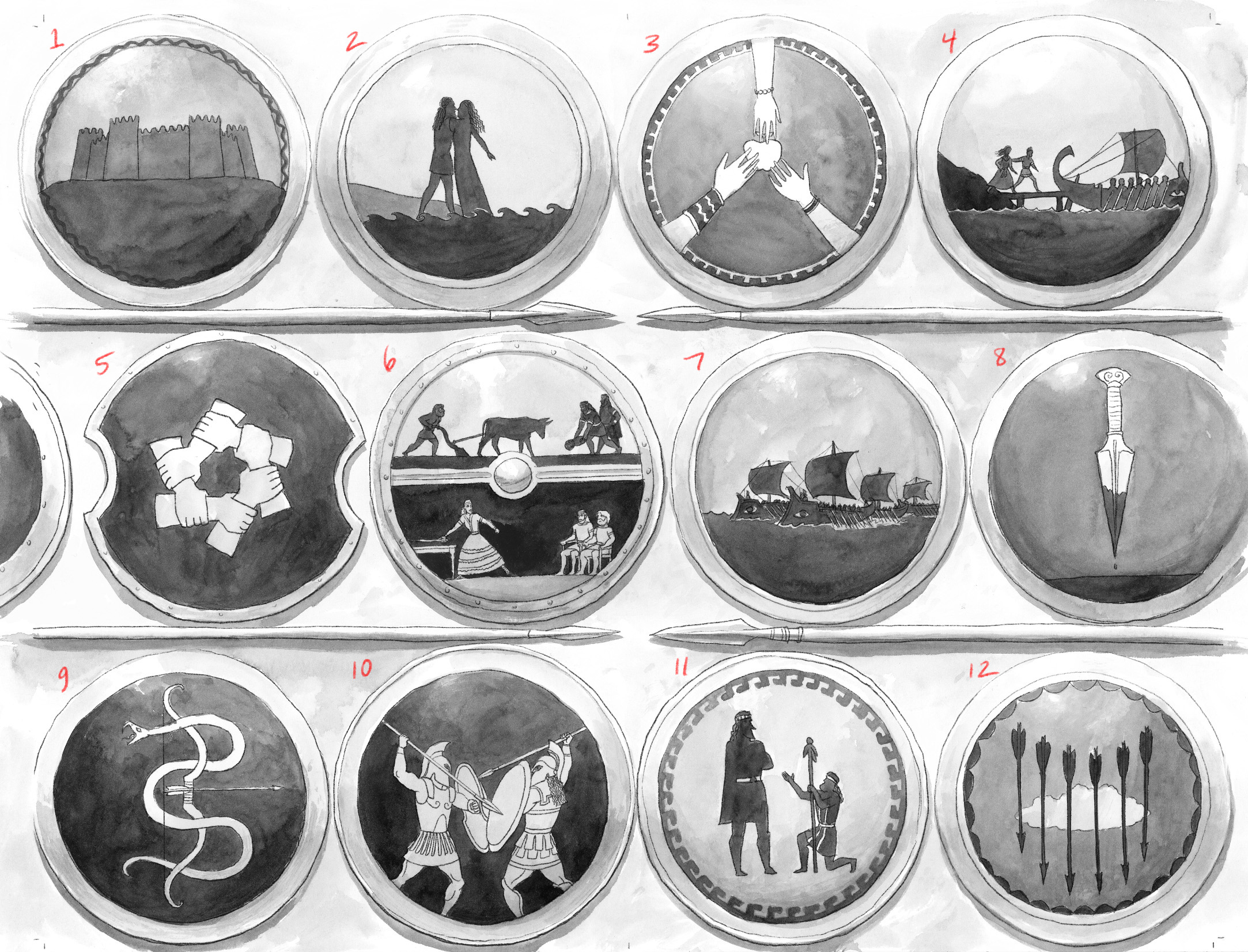
The designs on Greek shields tend to be much less narrative than the vase paintings, so in this case I didn’t use real historical ones. (Quite a few of the shield designs inside the book are real, though not necessarily from the Bronze Age — but these I made up to tell the story, stylizing them in a way I think is reasonably consistent with Greek shield painting.)

They summarize the story of the beginnings of the Trojan War, as follows: (1) the founding of Troy, (2) Thetis and Peleus, (3) the Apple of Discord, (4) the abduction of Helen, (5) invoking the oath of the Achaean Kings, (6) Odysseus and Achilles being tricked into revealing themselves (as, respectively, sane and not a girl), (7) the fleet launching, (8) the sacrifice of Iphegenia at Aulis, (9) the archer Philoctetes bitten by a serpent, (10) the beginning of the war, (11) Chryses’ appeal to Agamemnon, and (12) the plague-arrows sent by Apollo.

Those, by the way, are all cool stories you should look up if you don’t know them 😉

Not all of my books have bonus artwork on the endpapers of the hardcover. If you’re wondering why that is, continue to Part 2, In Which the Author Geeks Out About Bookbinding.

Continue Reading »

No responses yet

Feb 21 2016

Samurai Rising – process post

When I was contacted by Charlesbridge about possibly illustrating a nonfiction book about the legendary samurai Yoshitsune Minamoto, I jumped at the chance. The timing was great, as I was in transition between Macbeth and Poe, I’d been wanting to work with the Charlesbridge crew, and the subject matter is an intense interest of mine. I had done some karate and aikido as a kid, studied Japanese culture and language during high school and college, and spent a summer in Japan in 1990. On that trip I met lots of great people, tried kendo, got to visit a famous Japanese swordmaker, watched hours and hours of anime and sumo wrestling on TV, and learned what real jet-lag feels like. Later I took up aikido in a more serious way, and I’ve been practicing that art for over 15 years now. I also did an illustration project in college about Yoshitsune, so I knew the basics of his story — though at the time I was focused more on the legends about his early life than the real details of his military exploits. Anyway, I was quite excited to illustrate this book, especially once I had read the manuscript, which I found vivid, compelling, and action-packed. The author, Pamela Turner, has written lots of excellent nonfiction, lived in Japan, and practices kendo, and she brings all of that background plus a clever modern sensibility to the story.

The scope of the assignment was a cover plus an illustration for each of the 15 chapters, plus a title page spread and 4 maps, all to be painted in a loose brush-and-ink style.

I started filling up a sketchbook with rough pencil sketches for each chapter. I tried to keep these loose and focus on interesting silhouettes and compositions. I wasn’t sure yet whether these would be half-page or full-page illustrations, or exactly what the page size would be. I did 4-8 sketches for each chapter, and maybe 15 or 20 for the cover.

samurai sketches 2 samurai sketches 3Samurai sketches 1b

I discussed the sketches with my editor Alyssa Pusey and art director Susan Sherman. Once we narrowed down which ones we all liked the most, I did larger sketches digitally. We decided to go full-page, so many of the compositions had to be adjusted to fit the page size, and then tested opposite a chapter opening. Author Pam then checked the illustrations for historical accuracy. She researched this book so thoroughly, we all wanted to make sure I didn’t mess anything up.

Ch0 intro sketches v2 Layout 1 Layout 1

In order to do a loose brush painting, I actually needed to work out a fairly precise drawing, often with more information in it than the finished illustration would have. Then I put the drawing on a light table and painted over it, laying down the solid blacks first, then the grey tones. I used some carefully distressed, bristly brushes I’ve cultivated over the years (a good inking brush, as it ages, tends to lose its ability to keep a sharp point, but sometimes gains other magical qualities!).

Ch01 finish v1 Ch02 finish v1

Layout 1

brushes

We decided to do a wraparound cover, and Susan mocked up the type with our favorite sketch. I worked out the composition for the wraparound, then drew in more precise details. I tend to find horses a bit challenging to get right, so in addition to a lot of photo reference I also used a plastic horse that I bought on eBay and hung over my drawing table.

Layout 1Toy horse

Layout 1Samurai Cover finish grey

I did use digital techniques in a few places. Most notably, I replaced the ink wash sky in the original art with a color gradient and white clouds made by reversing black ink strokes I did separately. Then I added a layer of digital red and gold as accent colors.

sky brushstrokes 1

Samurai Rising Cover finish

Samurai Rising 003

I also got to help pick out the colors of the endpapers, the red ink of the cover type, the stamp and the paper for the casewrap, and even the striped pattern for the headband and footband.

Samurai Rising 017

Here’s one of the maps. It’s a brush painting with a grey wash digitally inserted behind it for the ocean. Labels added by the publisher.

Samurai map of japan

Charlesbridge has been wonderful to work with, and the book has been getting a great critical response. It’s on sale now, and I hope you’ll check it out. Thanks for reading!

2 responses so far

Aug 11 2015

Published by under Macbeth,odyssey,Poe,process

Today TeachingBooks.net is featuring an article I wrote about my process (in general, with specific focus on Macbeth). They also have a short audio clip I recorded about my approach to The Odyssey.

Poe status update: 1 month to go! Also, listening to The Iliad again in preparation for jumping into that.

No responses yet

Dec 30 2014

Something Wicked This Way Comes

Macbeth is coming in just a month. The official release date is Feb 10th.  You can pre-order it with your local/favorite indy bookstore or on Amazon, Barnes & Noble, Powell’s, etc. I will sign all pre-orders placed with Politics & Prose, and you can order signed copies directly from me starting a few days after the release. The eBook should also launch on Feb. 10th on most platforms.

To whet your appetite, I have set up an official product page (with interior preview) here. And now, I’m going to give you a look at the process I used to create this book…


This looping animation shows the different stages of drawing and coloring a page of Macbeth


As usual, I sketched the rough layouts using Adobe InDesign. This has the advantage of being super-easy to edit as I go along (as well as later, after I get feedback), being able to quickly move things from one page to another, use type and object styles to control document-wide formatting, and have a single master file. The main disadvantage is that the master file sometimes gets too big. I’ve learned various tricks to deal with that but it can still be a little tricky to manage.

After sketching and editing the rough layout, I printed each page in a light yellow and drew over it with pencil.

I scanned the drawings back in, used a b&w adjustment layer to get rid of the yellow lines, then did a greyscale value painting on a multiply layer over the pencil art.

I added textures I had created with ink washes on watercolor paper, then I added local colors and effects.

Sound effects go on their own layer so they can be removed or changed if the book gets translated into another language.

Finally, I dropped the art back into InDesign and drew clean borders and speech balloons.

– Artwork copyright 2014 by Gareth Hinds, shown by permission of the publisher, Candlewick Press, Somerville MA –

One response so far

Aug 27 2012

A drawing explained – Harvard Museum of Natural History

Published by under process,sketchbook

My friend Theo asked me to go out and draw with her sometime and try to teach her how I sketch from life. That seemed like a bit of a tall order, but I was very willing to give it a shot, and I think it actually worked fairly well. I should mention that Theo does have quite a bit of art experience already, so we weren’t starting from scratch.

So anyway, we walked over to Harvard and found a spot to sit and draw. This piece took about 40 minutes, with a few breaks to explain things. Since some of my readers may be interested in this topic, I will attempt to capture some of what I told Theo, and walk through the process of how I choose a composition and do a drawing from life.

First I look around for something interesting to draw. For me, that often means an interesting overlapping or framing of shapes. In this case Theo pointed out a tree she liked, and I found a distance and angle from which that tree (The small one) was framed by two larger trees, with the entrance of the Natural History Museum behind it.

I often start out with a quick “thumbnail” composition, to figure out the framing and the main elements I’m interested in. In this case you can see I’m emphasizing the curve of the small tree, the trunk of the pine on the left, and the large branch of the oak coming in from the right, and you can see how I tried both horizontal and vertical framing.

At this point Theo did a thumbnail which she didn’t like, and I encouraged her to work over it with a different, heavier tool. One way to think of an artwork is as a record of a process, and leaving the mistakes there often makes it much more interesting.

Next I transfer the rough composition to the larger size of the “real” drawing (unless I have skipped the thumbnail step). These are Theo’s photos (thanks Theo!).

Then I start to add some values and details. Because life sketching usually needs to be done quickly (whether because of changing light, need to eat, other time constraints, or just to stay loose), I try to find some quick, scribbly marks that represent the different types of leaves for each tree.

I deliberately experiment a bit here, because sometimes the first/automatic marks I make are something habitual that doesn’t really reflect what I’m seeing. This will be especially true if you are a beginner or haven’t drawn for a while — you might revert to some canonical leaf/tree shape you have in your head, ignoring what’s really there. It still happens to us professionals too.

Here’s a closeup showing the scribbly oak leaves and the much smaller/lighter leaves on the small tree below it. Note that for some of the closer oak leaves, I’m drawing (roughly) their actual shape. Having a few examples lets the viewer extrapolate to figure out what the other leaves on that tree would look like.

Theo was writing down my comments while I talked so she didn’t get another photo until I was pretty well along. I’m trying to work the whole picture plane without obsessing about any small areas of it, keeping the marks loose but based on observation. That’s important! By the way, that’s a Cretacolor Nero (medium) pencil I’m working with, on a Holbein multi-drawing sketchbook.

Here’s the finished drawing at the point where I chose to leave it. I could of course add/refine more details, but this basically captures what I was after, and if I worked it further it might lose some of its freshness.

Hope that was useful. I’m happy to answer questions in the comments.

One response so far

Mar 07 2012

Romeo & Juliet coloring work-in-progress

I haven’t been posting much as I have my nose to the grindstone coloring Romeo & Juliet. But for some reason this partially colored page demanded to be scanned and posted.

(Romeo, Mercutio and Benvolio on their way to the party at the Capulet mansion, just after the Queen Mab speech.)

2 responses so far

Dec 23 2011

Romeo & Juliet – digital inking in Manga Studio – the party scene

Here’s a little holiday present: my first making-of video for Romeo & Juliet, showing how I inked the double-page party spread using Manga Studio.

There was an export problem I couldn’t figure out how to fix, so the audio is a little out of sync at the end.

Warm holiday wishes to everyone!

No responses yet

Nov 17 2011

Romeo 3D

I thought it would be interesting to see if sculpting a few of my main characters in 3D would improve my ability to draw their likeness easily and consistently. I built a low-poly 3D base head and used Mudbox to sculpt the details. Obviously I didn’t take it to a fully-finished level, especially the hair, but this is more or less what Romeo looks like.

The jury’s still out on whether this was useful or not, but it was kind of fun anyway, and makes me feel just a little less out of the loop as far as 3D graphics.

No responses yet

Nov 09 2011

Gifts From the Gods – process

Here’s the process post I promised for Gifts From the Gods. This process is an evolution of the techniques I used for The Odyssey.

First I read through the text a few times, then started doing some rough sketches on paper. At the same time, I was discussing the page dimensions, typography, and other design factors with my designer at Houghton — in this case, the extremely talented Scott Magoon. Once we nailed down some of that stuff, I scanned my sketches and started experimenting with the page layouts.

I also made sketches directly in InDesign, using the vector pencil tool, as you can see in the right-most panel.

When the rough layouts were edited and approved, I printed each page in very light blue on cheap drawing paper and did a pencil drawing over it. I scanned that back in and removed the blue lines (using the “black and white” filter in Photoshop), darkened the lines to a truer black, and made any necessary edits to the drawing.

In some cases, I “test-colored” the drawings in Photoshop, so that I could play around with the colors a bit before using watercolor.

I enlarged and printed out the darkened-and-corrected pencil drawings on a piece of 140lb. cold-press watercolor paper, using my Epson Stylus 2200 printer, which prints up to 13×19″ and uses ink that is waterproof under most conditions. Actually, it kind of repels water, so I often have to go over each stroke twice to get the paint to cover the linework. I painted the art with watercolors, scanned it back in, and made any additional corrections — for example, I decided later to remove Achilles’ helmet, since he was bare-headed in the previous battle scenes.

Lastly, I had lots of fun creating the decorative borders at the beginning of each story. The linework for these was drawn directly in InDesign and cloned for symmetry. Again I printed them out on watercolor paper, and I painted them with acrylic. I composited the faux-stone painted texture behind the borders using Photoshop, because I didn’t want to accidentally splatter paint over the border art.

That’s it! Sorry, I didn’t take any videos this time — but I AM taking videos of Romeo & Juliet as I go along, and I will start posting a few tidbits from that soon.

No responses yet

Sep 09 2011

Cartooning isn’t all fun and games, kids

Section of coffered barrel vault celing I’m working on for the party scene in Romeo & Juliet:

2 responses so far

Next »